Housing costs are represented in the following figures and compared based on Census Tracts (CTs) and Dissemination Areas (DAs), which are scales of stable geographic areas for census data. According to Statistics Canada, population of a census tract ranges from 2,500 to 8,000 people while dissemination areas have much less due to their smaller sizes. Figure 1 shows the median value of dwellings. The data is based on 2016 survey by Statistics Canada.
MEDIAN SHELTER COSTS (CTs vs DAs)
UTM Zone 10
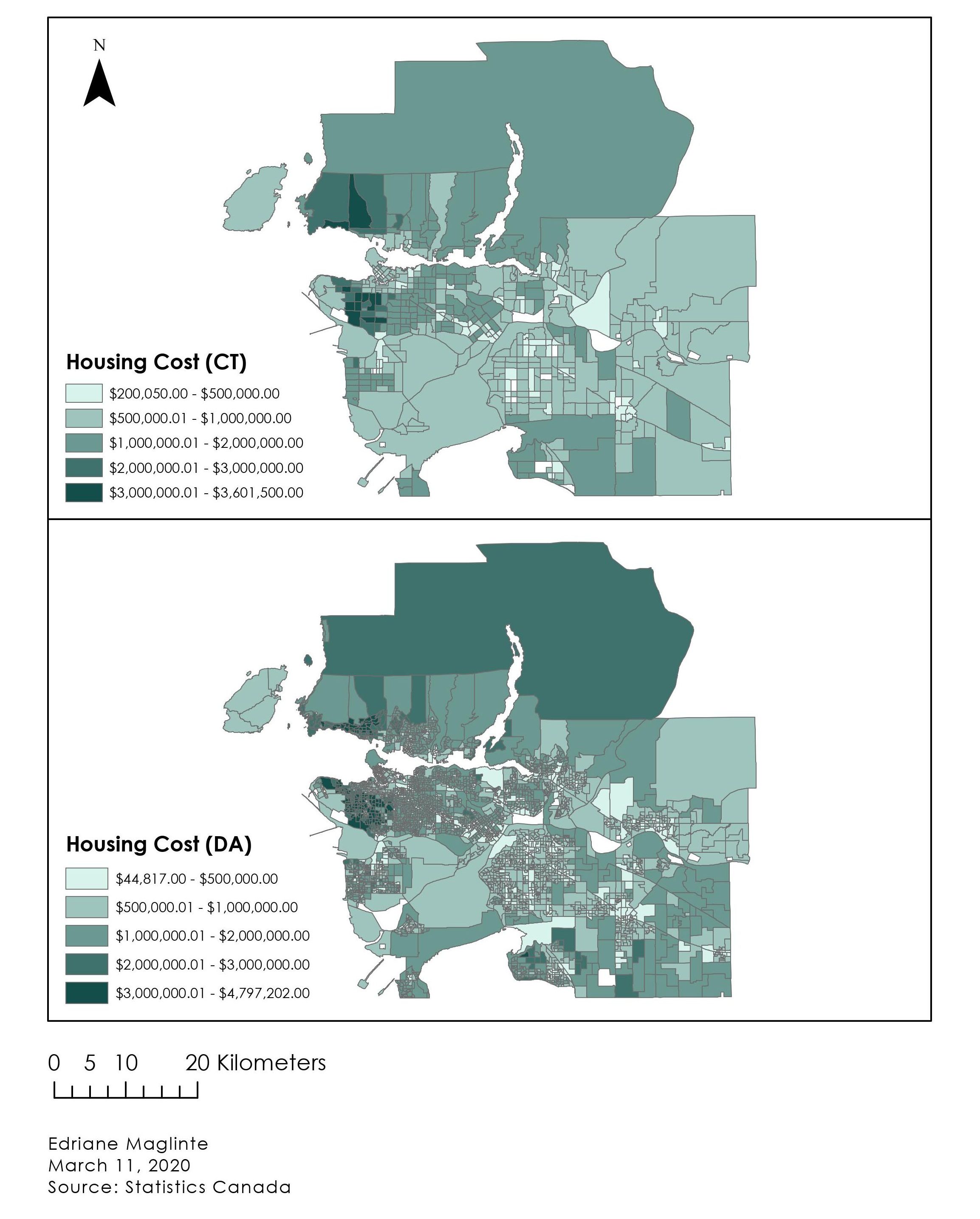
I set the minimum value to the lowest cost in each CT and DA because having values of 0 would be unrealistic in terms of housing costs and, thus, suggests that there is no data available for the blocks that appear blank or white. For consistency, the classification method used for Figure 1 is manual breaks/interval. The point is to see the contrast made by different scales of geographic area.
Figure 2 shows the same census tract data as Figure 1 but in different classification methods. Natural breaks, standard deviation, and equal interval are all computer-generated. Natural breaks is the default method in ArcGIS (values grouped into 5 classes). However, sometimes this method may not be accurate while other class breaks may be more suitable. Manual breaks are very helpful when comparing, for example, housing costs in two different cities. In this case, values must be consistent in order to draw an accurate comparison.
DATA CLASSIFICATIONS (CENSUS TRACTS)
UTM Zone 10
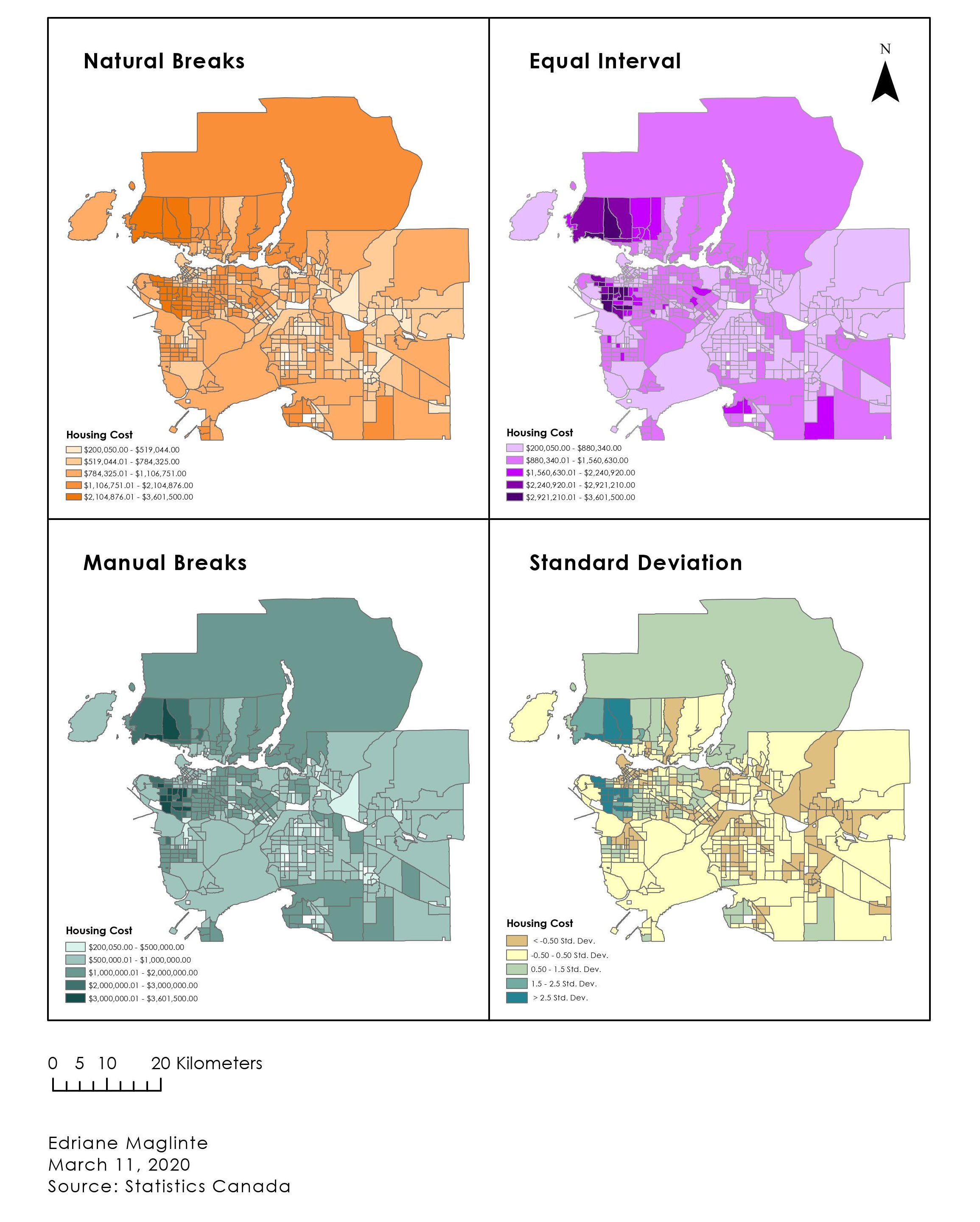
Vancouver has been one of the most expensive places to live in. The Equal Interval classification underestimates the reality of Vancouver housing prices. Even though the data used is technically the same as for other maps, this method looks more inaccurate compared to the other three. Inaccurate representation, in this case, of housing prices can deceive others, which would likely be unethical. It is not to say that the equal interval method is wrong. One must consider the biases each method creates and decide which works best to accurately represent the data.
Finally, the affordability rates, shown in the figure below, are based only on the census tract data because the dissemination areas contained more null values. The data is grouped into 4 classes in manual breaks: minimum, 20%, 40%, and 60% respectively.
AFFORDABLE* RENT IN METRO VANCOUVER
UTM Zone 10

Affordability is measured by rental costs in relation to the household income. In this case, housing rent/mortgage payments that are less or equal to 30% of the household's gross income are considered 'affordable'. Figure 3 shows that much of Vancouver (city) is unaffordable, especially in the downtown area and the North Shore. However, there are still inaccuracies in this map. Although a large portion of North Vancouver is labeled as unaffordable (40-60%), a few census tracts are quite huge in size and do not reflect the housing availability in the area—some parts of the CTs might be forests/undeveloped.
Representation of data can vary depending on how they are classified and one must be aware of the tradeoffs, biases, and inaccuracies generated by various methods.